720.768.8493
fitzpatrickriley10@gmail.com
fitzpatrickriley.cargo.site
fitzpatrickriley10@gmail.com
fitzpatrickriley.cargo.site
The Clayroom Rebrand![]()
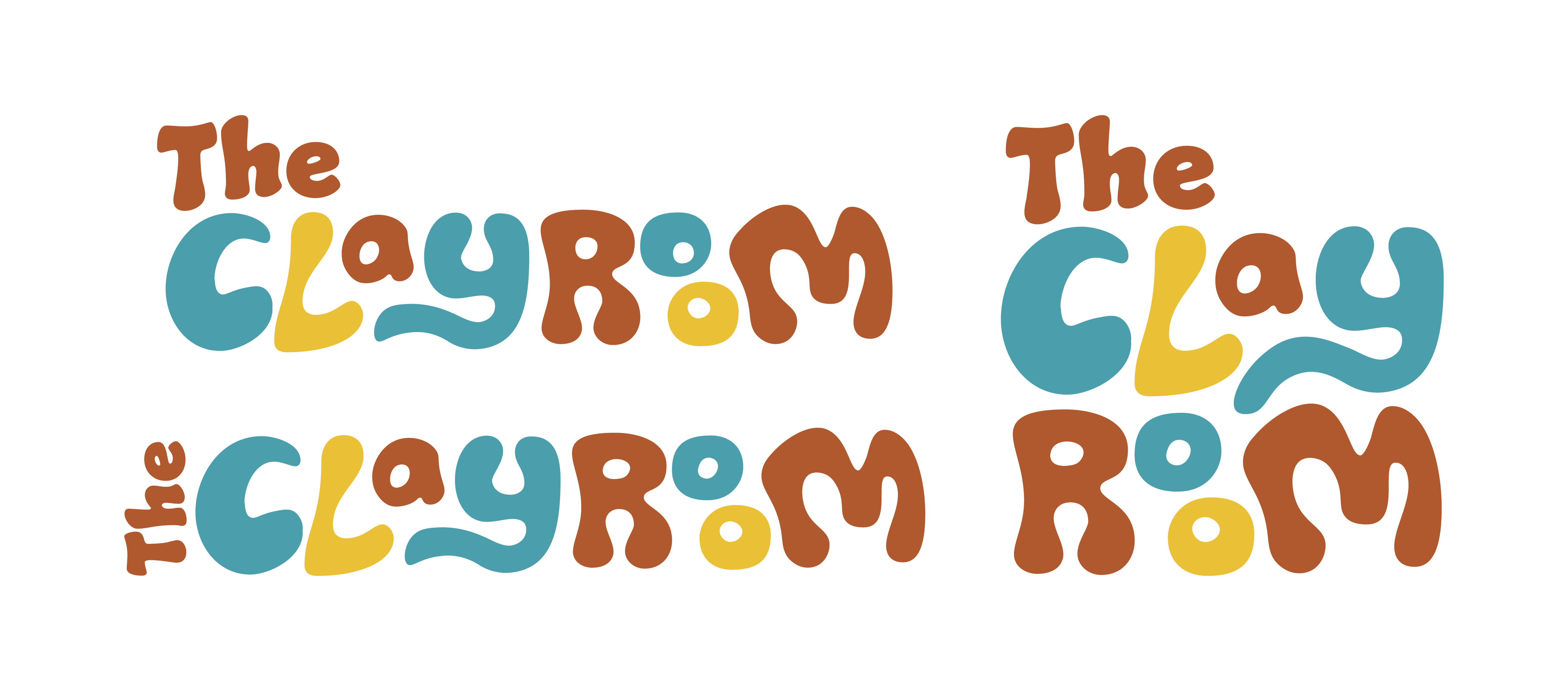
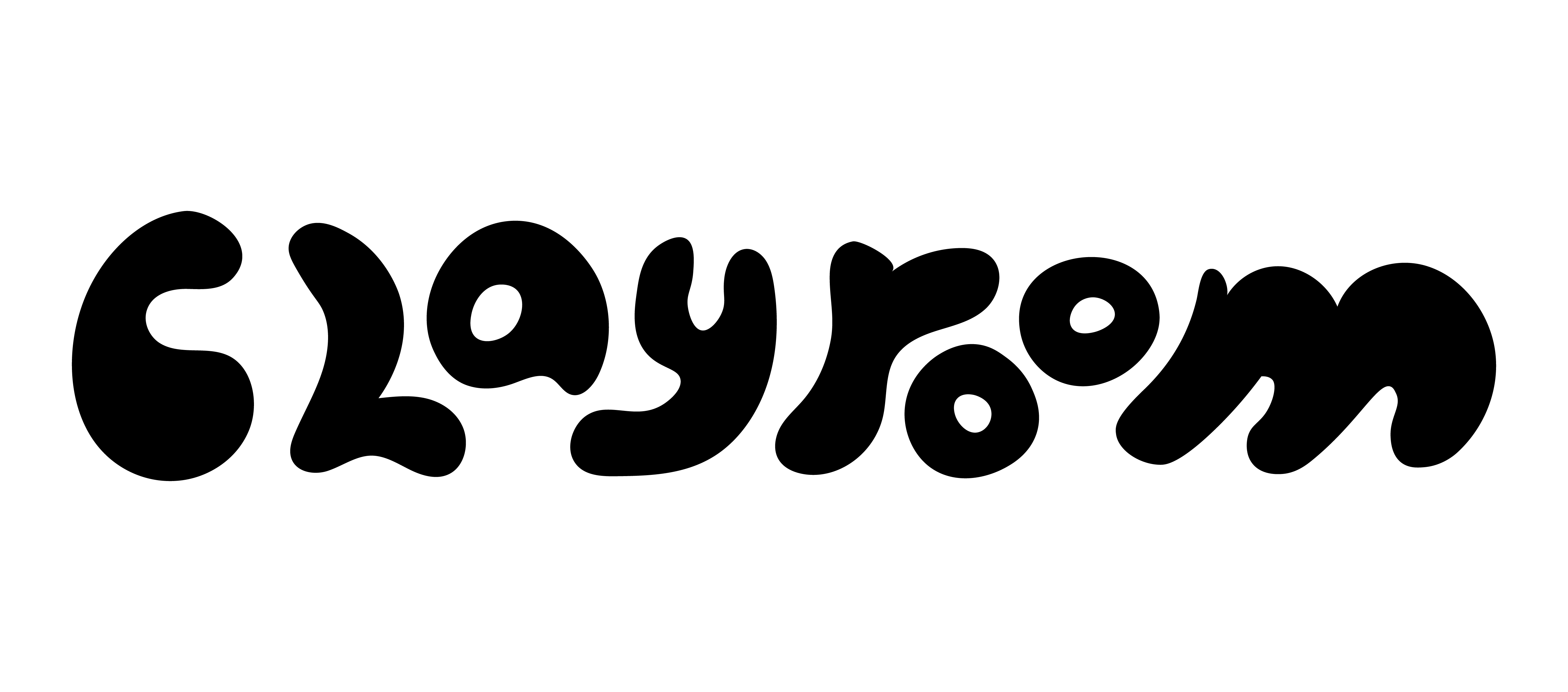
This is a rebrand project for The Clayroom, a paint and create your own pottery studio in Brookline, MA. The campaign focuses on a recognizable wordmark that takes inspiration from handmade, clay-like forms.
I started my design process by sketching ideas for a wordmark.
The Clayroom’s old original wordmark puts each letter inside its own piece of pottery. I wanted to emulate the sam playful tone in the new one by taking inspiration from clay forms.Sketch & Original Synthemesc Typeface

Final B&W Wordmarks

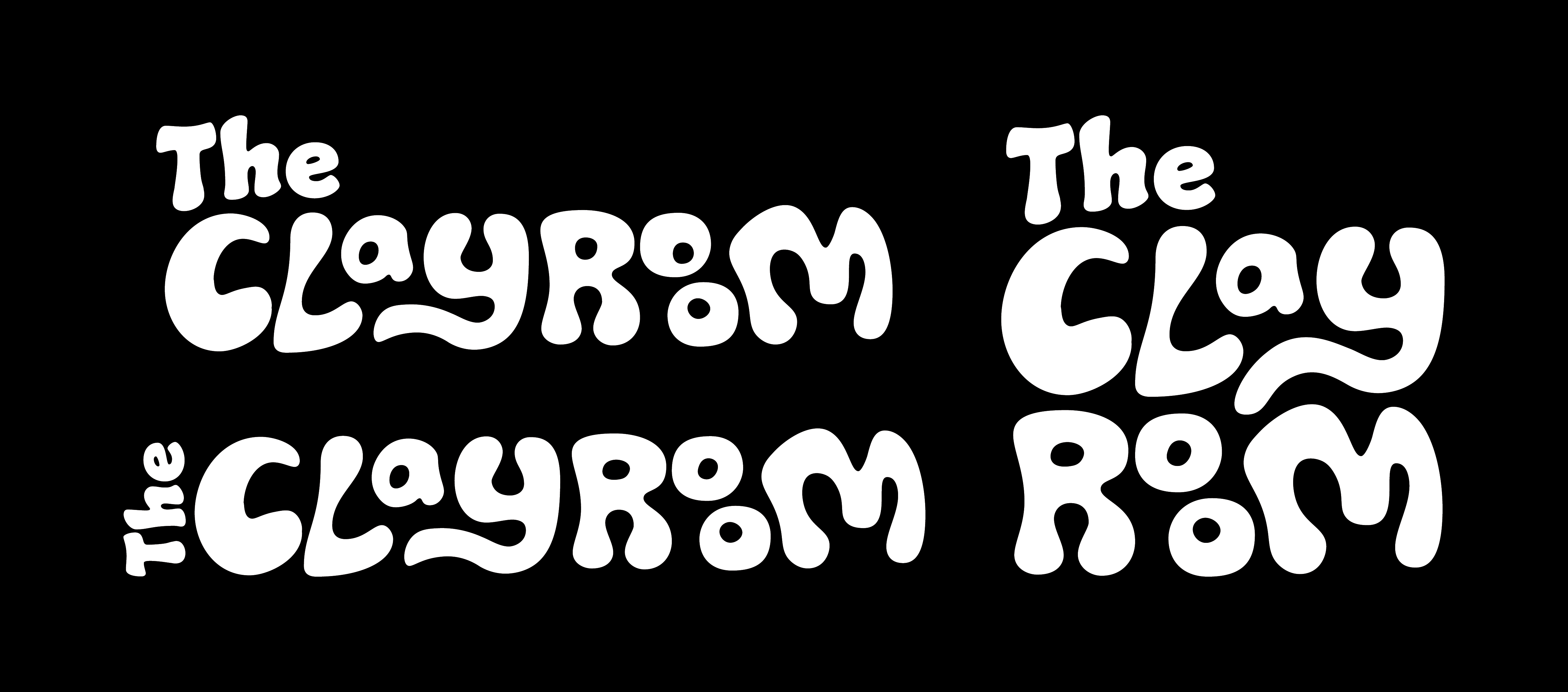
I created a digitized on of my sketches and then found an existing typeface by Typodermic Fonts called Synthemesc to work off of when making the wordmark. The final design that I went with is meant to have a fun handmade look to it.
Early vs. Final Color Palletes


For the rebrands new colors, I experimented with both earthy clay toned colors along with bright childish colors which matched the studio’s main demographic. I eventually decided to combine both into a pallete that consists of yellow, brown, and blue.
Drafts:
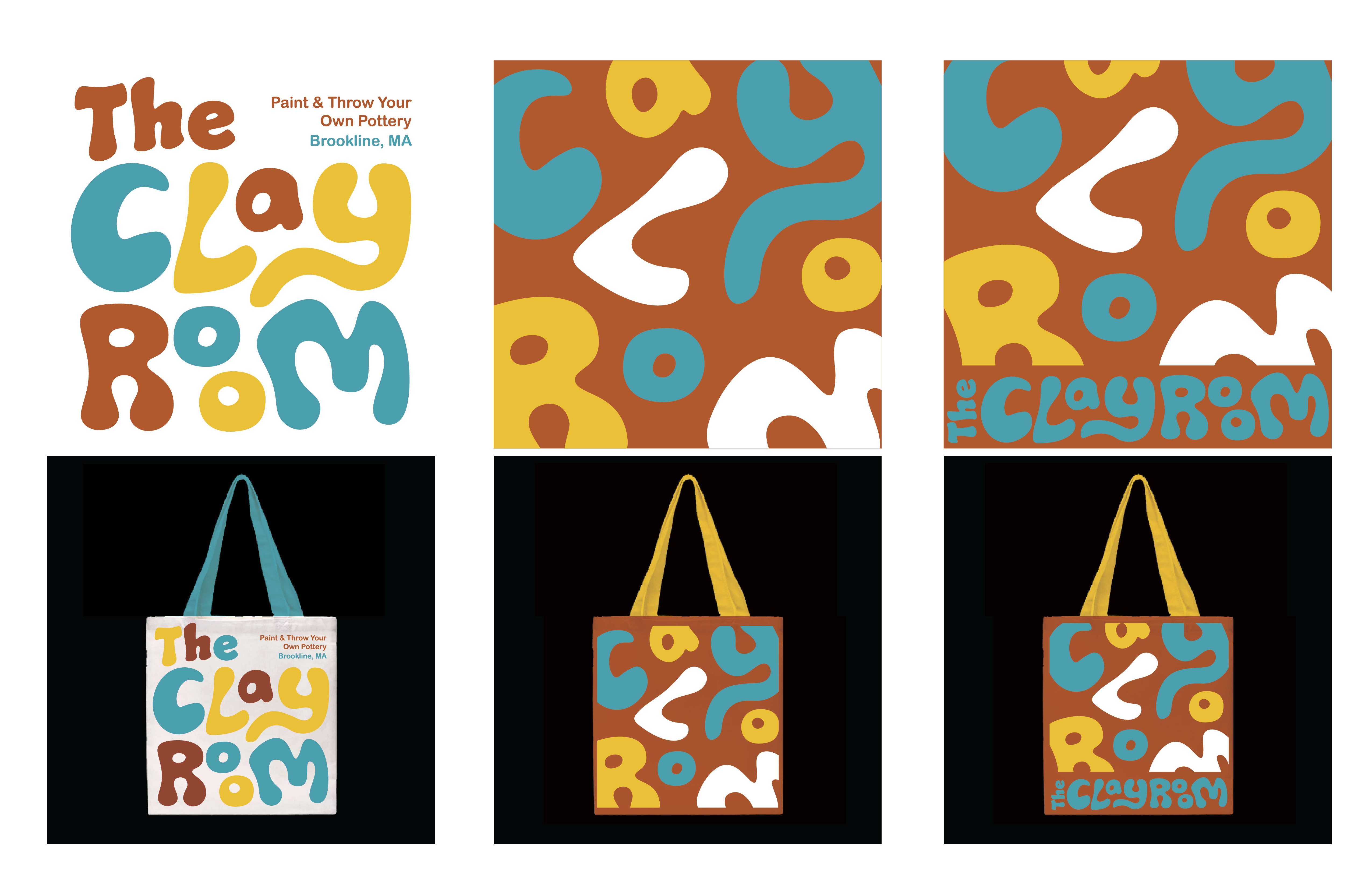
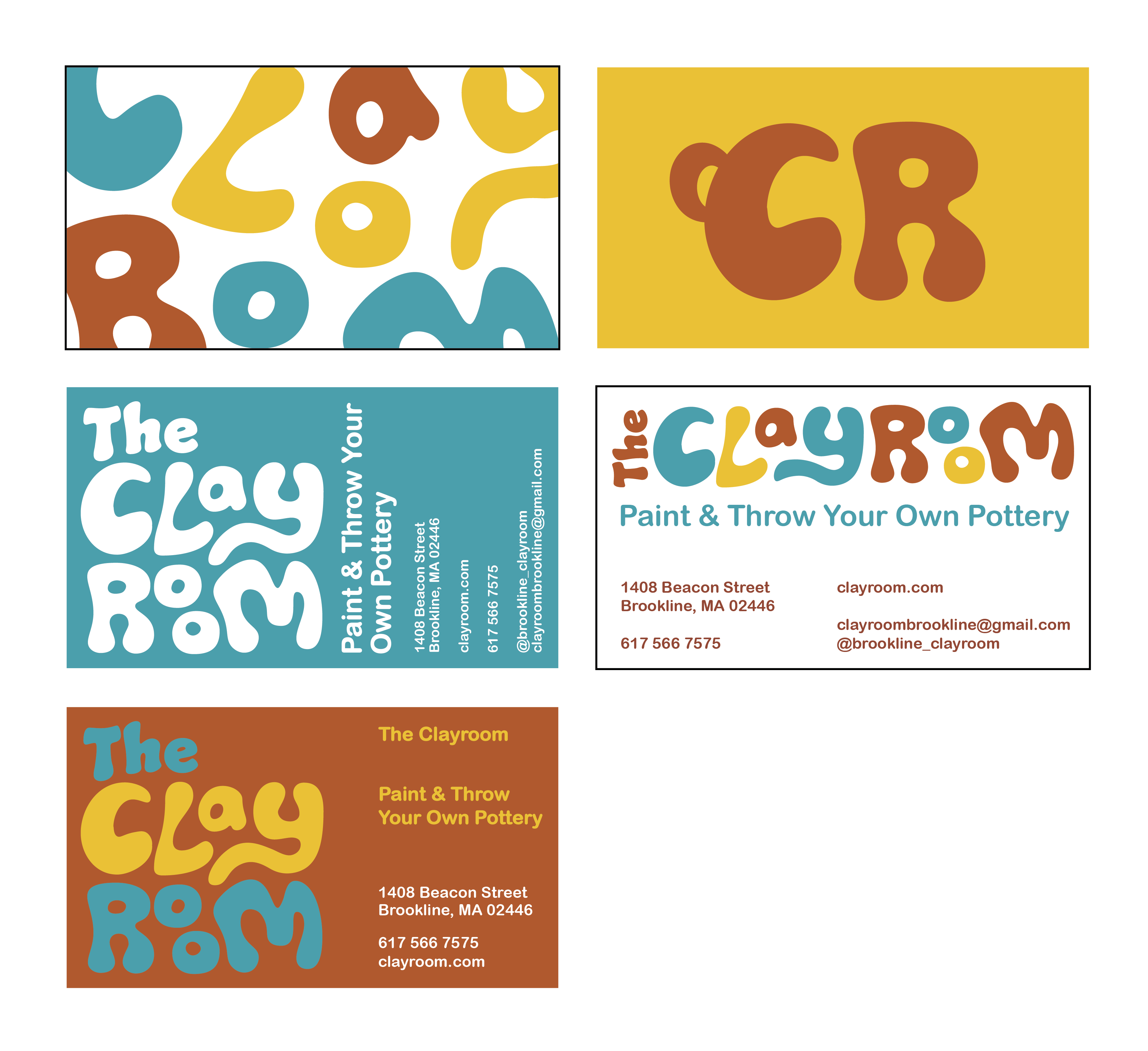
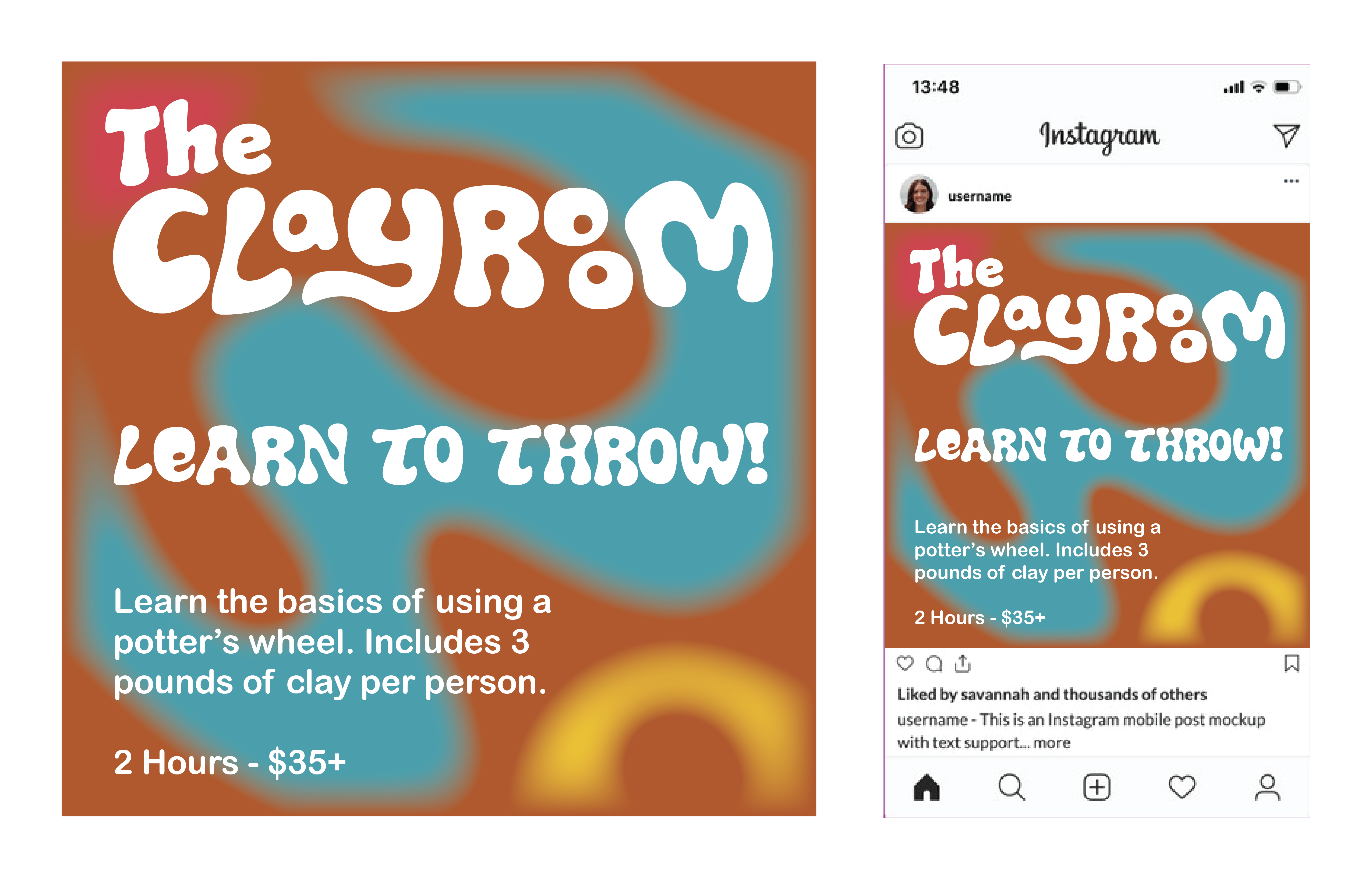
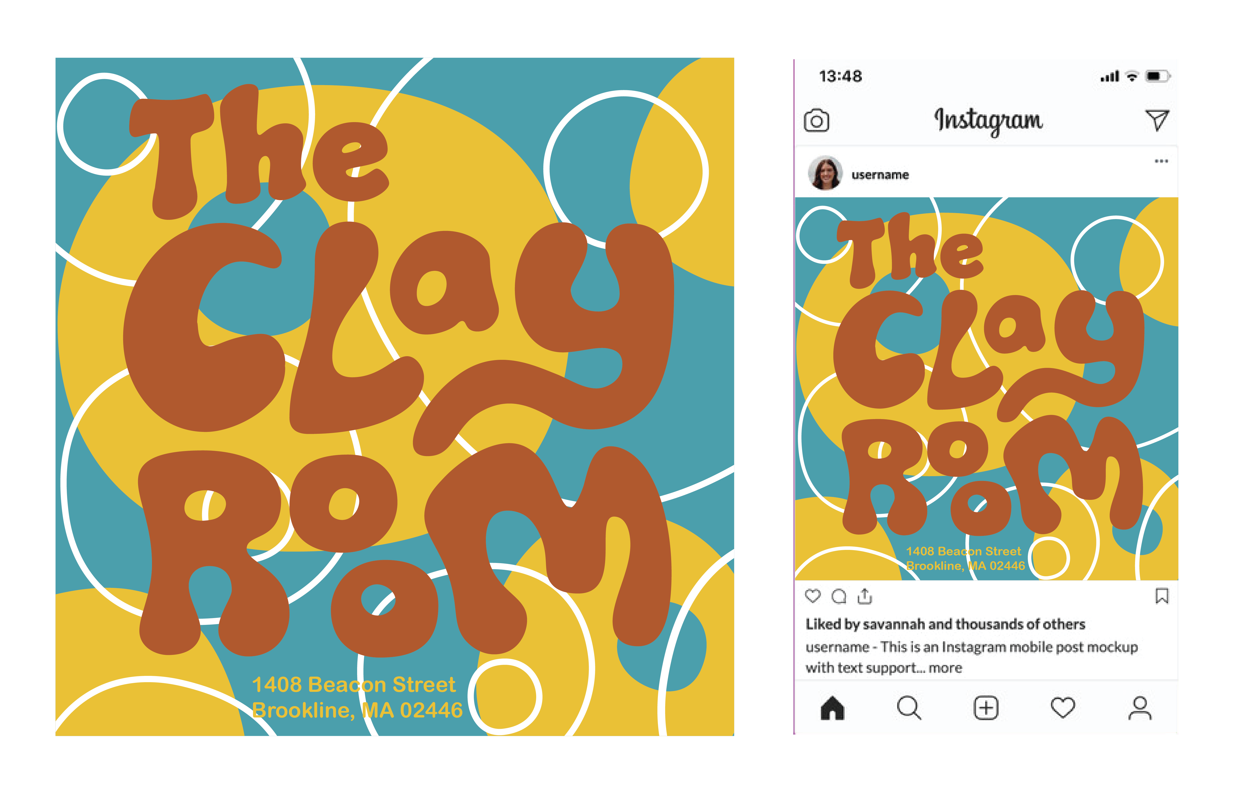
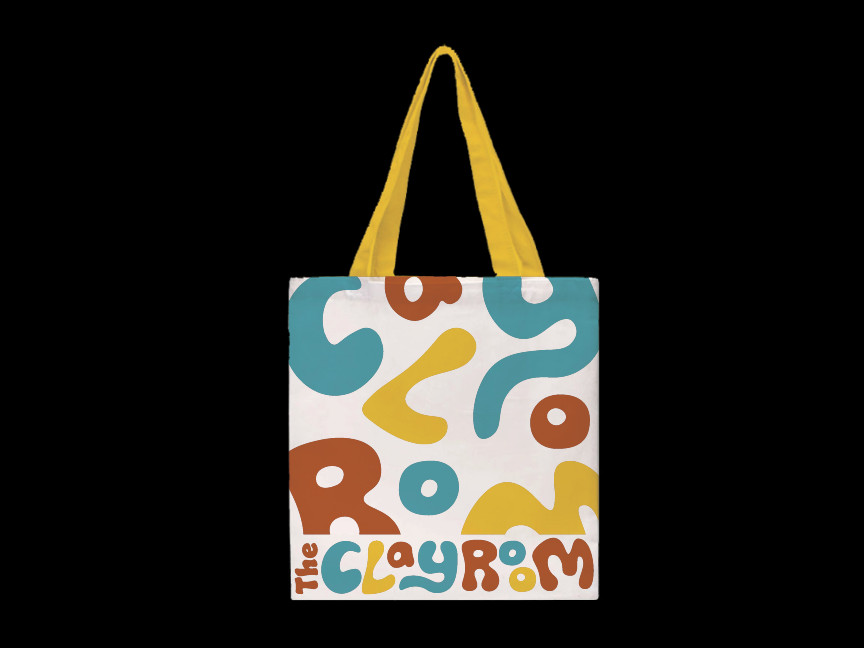
This visual system was then applied to instagram posts, a tote bag, and business cards, which use shapes and patterns taken from the letterforms of the wordmark.
Final Application:


© 2023 Riley Fitzpatrick
