720.768.8493
fitzpatrickriley10@gmail.com
fitzpatrickriley.cargo.site
fitzpatrickriley10@gmail.com
fitzpatrickriley.cargo.site
Zinnia Key Art Visuals
The goal of this project was to develop a new visual identity for Zinnia’s key art and visuals. For a new direction, I wanted to convey something that connects to Zinnia’s core values of simplfying complexity and create visuals that feel futuristic, clean, structured, comprehensive, and efficient.






I started the process by looking at Zinnia’s old key visuals, which focused on people and used the petal shape from their logo as a repeated element, and though about things like what was successful, what seemed outdated and needed updating, how do they connect back to the current brand, and what made the old visuals unique. From there, I began researching and collecting examples from other brands that have interesting art that matched with what we wanted for Zinnia.


From there, I grouped everything I had collected into different categories and began expanding on, exploring, and testing out potential directions for Zinnia’s new key art and visuals.


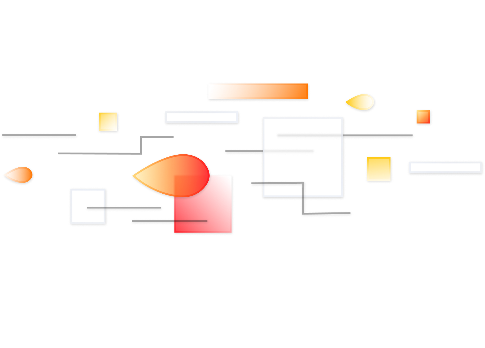
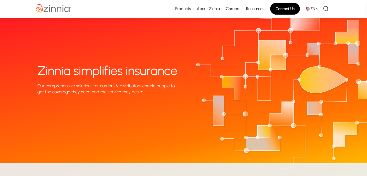
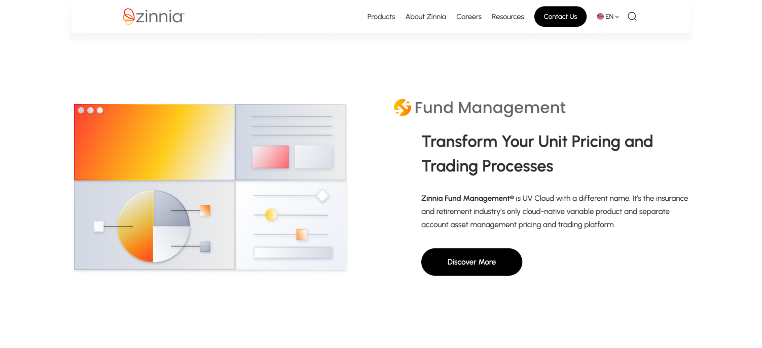
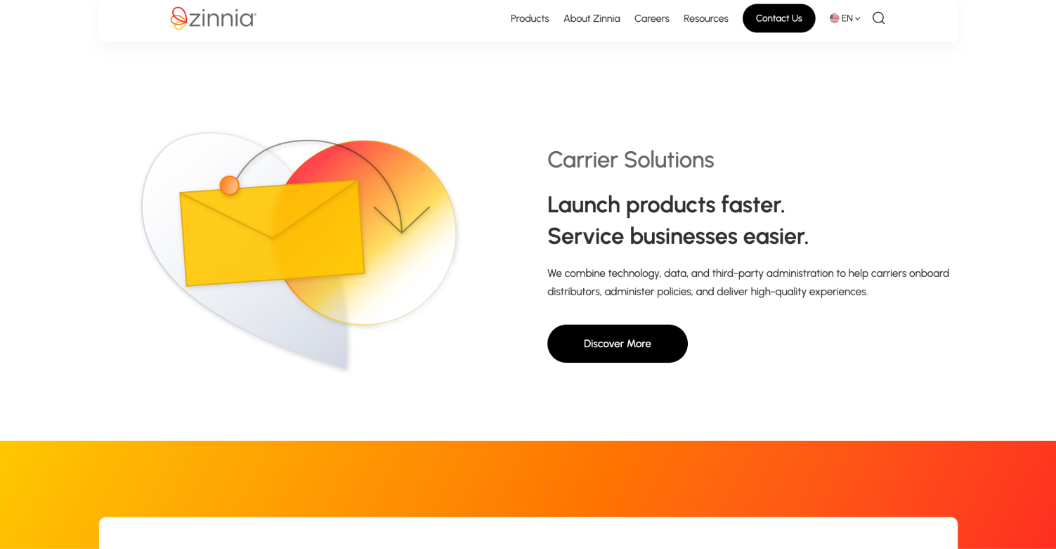
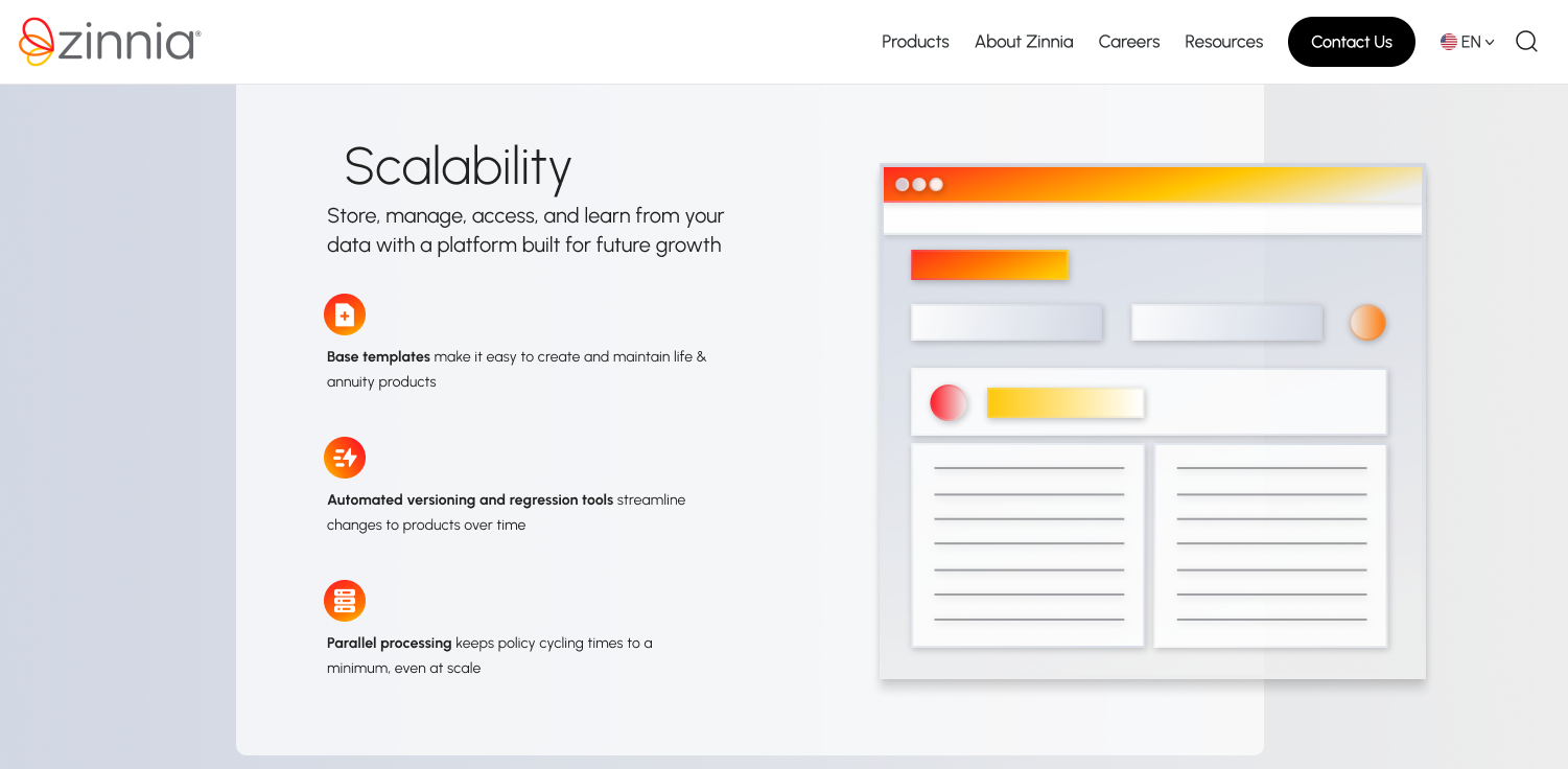
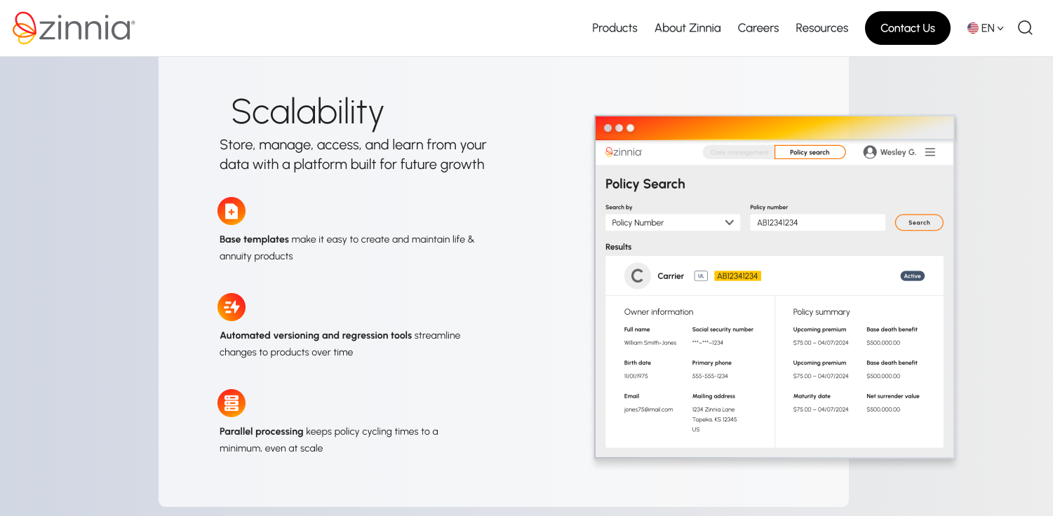
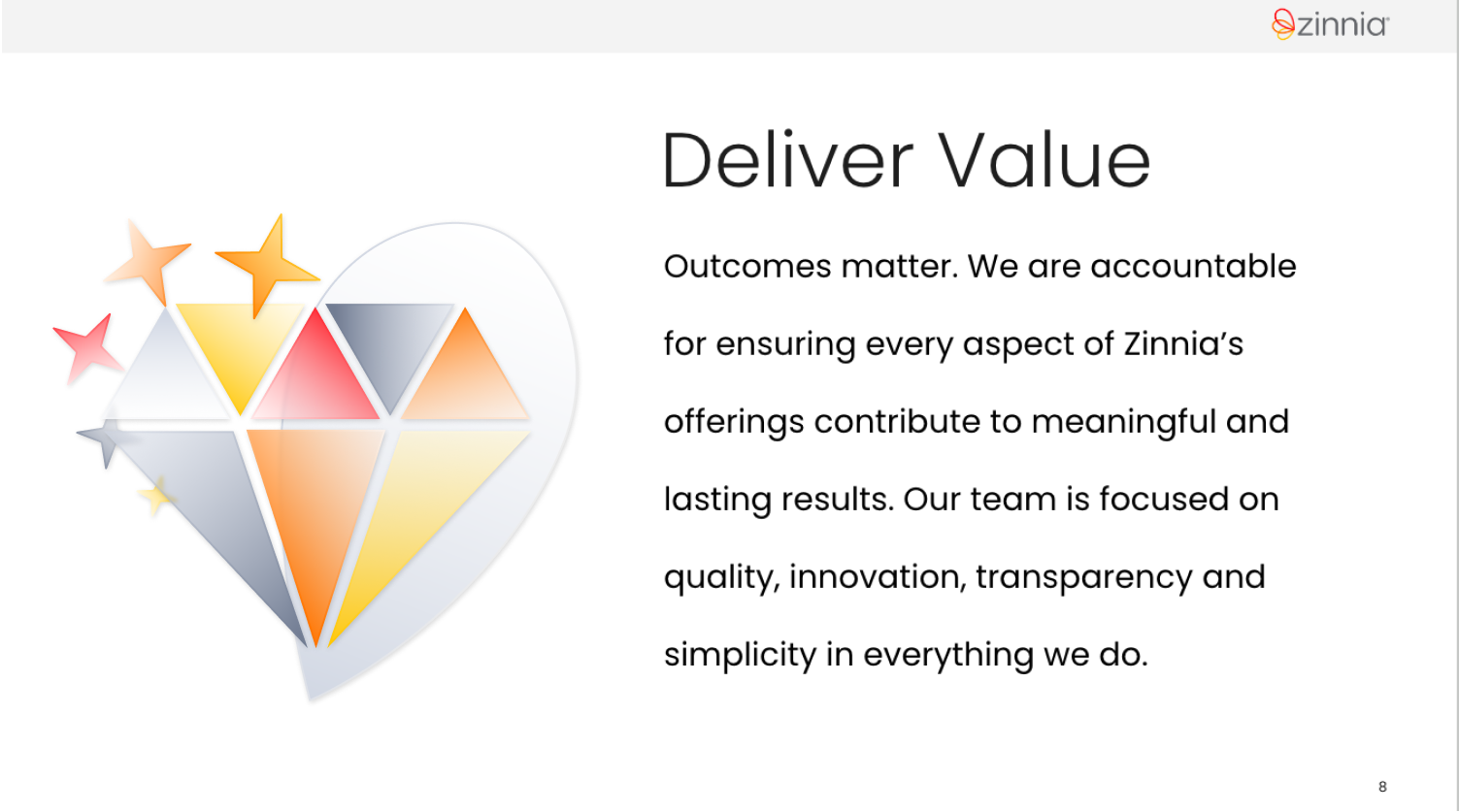
The final concept is made from simple geometric shapes, lines, and transparent gradients that create a new smooth, clean, updated look for Zinnia’s key art. While this concept is made from 2D elements, the gradients, transparency, and overlapping elements create a nice refined and dimensional look.


This final direction offeres versaility in its ability to be rearranged, recolored, rescaled, and updated to fit various needs. It can adapt to fit a wide range of contexts, depict a range of anything from literal objects to abstract ideas, and convey both a serious and professional tone, for external purposes like webpages or social posts, alongside a more playful tone for internal branding.







© 2024 Riley Fitzpatrick